Your landing page can make or break your business. Slow load times, unclear messaging, or poor mobile design can drive visitors away in seconds. But small, targeted updates can turn a struggling page into a tool that converts visitors into clients.
This article breaks down how three coaching businesses - Blinkist Coaching, MAP Coaching Institute, and Pacific Life Coach - improved their landing pages. Here’s what they did:
Each redesign focused on clarity, usability, and reducing friction for users. If your landing page isn’t performing, analyze your metrics and tackle one issue at a time - like improving CTAs or simplifying forms. Even small changes can deliver big results.
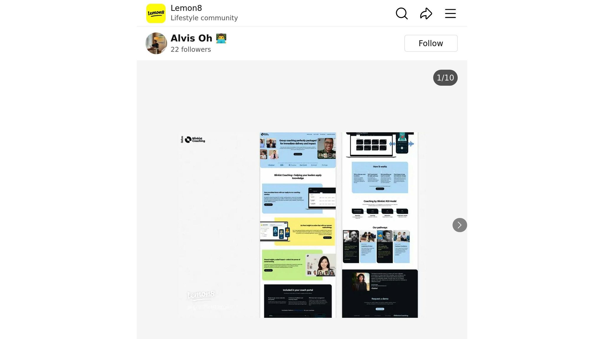
The landing page for Blinkist Coaching had one major flaw: it didn’t clearly explain how the service worked. This left visitors scratching their heads, unsure of what Blinkist Coaching actually offered. Like many coaching websites, it had a "How it works" section that was hard to follow, which meant fewer people were clicking on the call-to-action buttons.
"Without clear and easily understandable steps, people can misinterpret them, or simply don't feel enticed to click on the call-to-action button." – Alvis Oh [1]
On top of that, the value proposition wasn’t clear. Potential clients couldn't easily see how Blinkist Coaching could benefit them.
In July 2024, Blinkist Coaching revamped its landing page with a focus on making everything more straightforward and user-friendly. The biggest change? A complete makeover of the "How it works" section. Instead of vague and confusing steps, the new design introduced detailed visuals that broke down each stage of the coaching process. This made it much easier for visitors to understand what to expect, from signing up to achieving their goals.
Another key change was the placement of call-to-action buttons. These were strategically repositioned to encourage immediate interaction, helping visitors take the next step without hesitation. The redesign aimed to make the benefits of Blinkist Coaching crystal clear, showing users exactly how the service could help them succeed.
While specific conversion data hasn’t been shared, the redesign was intended to minimize confusion and encourage more signups. The Blinkist Coaching example highlights a common challenge for coaching services and shows how thoughtful updates can make a big difference. Up next, we’ll look at how MAP Coaching Institute tackled similar issues with its redesign.

The original landing page for MAP Coaching Institute struggled to convert visitors effectively. Its unique value proposition wasn’t highlighted, leaving potential clients unsure about what made the service stand out. On top of that, important details - like the coaching process and pricing - weren’t easy to find, which likely created unnecessary friction for users navigating the site.
The redesigned page tackled these issues head-on by focusing on clearer messaging and a smoother user experience. Unlike Blinkist, the MAP Coaching Institute revamped its approach with a sharper visual hierarchy and messaging that grabs attention right away. A bold headline and a short, clear explanation of the coaching methodology now greet visitors immediately. Key information was moved above the fold, making it easy to access, and client testimonials were added to build trust. They also streamlined the lead capture process, making it simpler for visitors to take the next step.
While specific performance data hasn’t been shared, the redesign follows proven strategies for improving user flow and communication. These updates are likely to have increased engagement and conversions. Up next, we’ll take a look at how Pacific Life Coach made further improvements.

Pacific Life Coach's landing page initially faced challenges in delivering a clear message and engaging users effectively. The design lacked a proper visual hierarchy, making it hard for visitors to grasp the services offered at first glance. The navigation menu was cluttered with too many options, and the call-to-action (CTA) buttons were poorly designed, blending into the background rather than standing out. Visitors also had to scroll through multiple sections to understand the value of the services, as the unique selling points weren't immediately obvious.
Additionally, social proof was buried deep in the page, with testimonials placed in lower sections where they were likely overlooked. The contact form was another pain point - it was overly long and awkwardly positioned, creating unnecessary barriers for potential clients wanting to get in touch.
The redesign aimed to create a more user-friendly experience that naturally guides visitors toward taking action. The updated layout now features a bold, attention-grabbing headline that clearly communicates the benefits of the coaching services right away. Navigation was simplified, cutting down to just the essential pages, which helps visitors focus and reduces decision fatigue.
A standout call-to-action button, placed prominently above the fold, uses contrasting colors to ensure it catches the eye. To build trust, client testimonials were moved to more visible locations, making it easier for visitors to see positive feedback. The contact process was also revamped, now featuring a simple two-step form that asks for only the most necessary information, minimizing friction.
Visual elements received a major upgrade as well. Professional photography and a cohesive color scheme now create a polished, inviting look. The mobile experience was prioritized, with faster load times and a design that adjusts seamlessly to smartphones and tablets. These focused changes were designed to make the page more engaging and conversion-friendly.
While specific numbers aren't available, the redesign aligns with proven conversion optimization strategies. The revamped layout and improved CTAs are expected to reduce bounce rates and encourage users to spend more time exploring the page. The simplified contact process and better CTA placement should, in theory, lead to higher lead generation rates compared to the original design. By addressing key usability issues and improving the overall experience, the redesign positions Pacific Life Coach for stronger results.
Redesigning landing pages for coaches comes with notable benefits, but it's essential to weigh these against the challenges of maintaining ongoing improvements.
Better conversion rates.
Well-optimized landing pages can achieve conversion rates of 5.31% or higher - more than twice the average rate of 2.35% [3]. This means more consultation bookings and client sign-ups.
Clearer visual hierarchy.
A refined visual hierarchy helps visitors immediately understand your value proposition, making your message more impactful [2][5].
Limitations of generic templates.
Using one-size-fits-all templates can dilute your unique brand identity and negatively affect conversions [4].
The importance of ongoing updates.
Regularly improving your landing pages pays off. Businesses with over 40 landing pages generate 500% more leads compared to those with fewer than 10 [3]. It highlights the effectiveness of customized, highly targeted pages.
Maximized results with Conversion Rate Optimization (CRO).
Investing in CRO can double your results without increasing your traffic or ad spend [5].
Think of landing pages as evolving tools, not static assets. By consistently testing and refining them, you’ll create a smoother journey for potential clients. For expert help with redesigns that combine data-driven strategies and smart automation, check out Humble Help (https://humblehelp.studio).
The examples of Blinkist Coaching, MAP Coaching Institute, and Pacific Life Coach show a common theme: the most effective landing pages focus on simplicity and clarity. By refining their messaging, streamlining navigation, and emphasizing core benefits, these businesses achieved noticeable improvements.
If you’re looking to optimize your landing page, start with a headline that grabs attention and speaks directly to your audience’s needs. Each of these redesigns succeeded because they led with benefit-driven headlines addressing specific pain points.
Make changes gradually. For instance, test one adjustment at a time - like simplifying a form or making your call-to-action (CTA) more prominent - and track the results. Pacific Life Coach demonstrated how removing unnecessary form fields, speeding up page load times, and featuring a single, clear CTA reduced friction and boosted conversions. These seemingly small tweaks can deliver big payoffs.
Take a close look at your page’s performance metrics, identify areas where users might be dropping off, and make targeted updates. And if you’re feeling stuck, Humble Help specializes in creating landing pages tailored for coaches, helping you turn more visitors into scheduled consultations.
The bottom line? Small, thoughtful adjustments can lead to significant improvements. Your landing page doesn’t need to be flawless from the start - what matters is consistent, focused effort to make it better over time.
If your coaching landing page is struggling with low conversion rates, high bounce rates, or a noticeable drop in traffic, it might be time to rethink its design. These issues often signal that the page isn’t capturing visitors' attention or meeting their needs effectively.
Other warning signs include an outdated design, clunky user experience, or slow load speeds. And let’s not forget: if your page isn’t mobile-friendly or doesn’t reflect your current branding or business goals, it’s overdue for an update. A refreshed, thoughtfully designed landing page can make all the difference in connecting with your audience and turning visitors into clients.
To measure the impact of your landing page redesign, pay close attention to metrics such as conversion rate, bounce rate, page views, and average time on page. These numbers give you a clear picture of how well your page is drawing in visitors, keeping their attention, and encouraging them to take action.
By comparing these metrics before and after the redesign, you can pinpoint areas of improvement. Ideally, a successful redesign will result in more conversions and increased engagement, making your landing page a stronger tool for growing your coaching business.
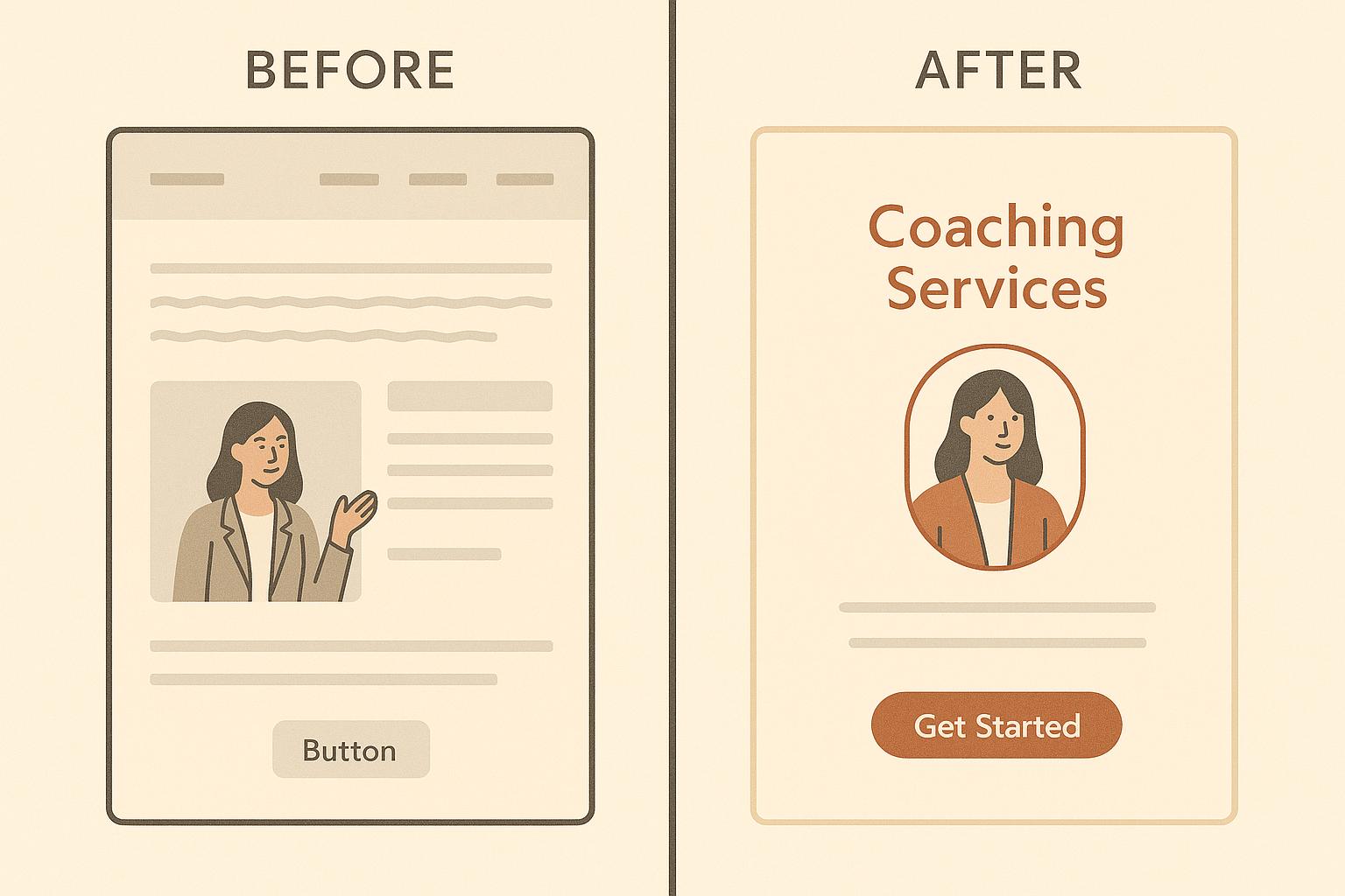
To make your call-to-action (CTA) buttons more effective on your coaching landing page, focus on crafting clear, benefit-driven text that speaks directly to your audience. Use phrases that inspire action, like “Start Your Free Trial” or “Book Your Free Session”, to motivate visitors to take the next step.
Design-wise, your buttons should stand out visually. Use bold, contrasting colors that grab attention and make it easy for users to spot them. Place these buttons in prominent locations, such as above the fold, ensuring they’re one of the first things visitors notice. Keep the surrounding design simple and uncluttered to maintain focus on the desired action.
With these approaches, you can guide your audience toward engaging with your offer and boost your conversion rates.
Discover strategies to elevate your business.