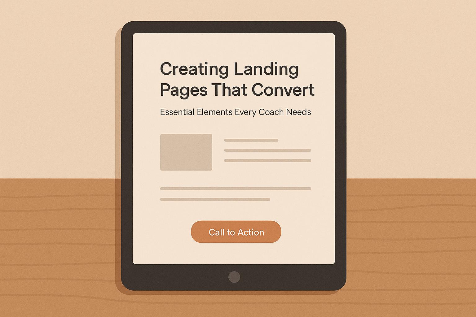
Creating a landing page that drives results starts with focusing on a single goal - whether it's booking a call, downloading a resource, or signing up for a program. Unlike cluttered homepages, landing pages guide visitors toward action with clarity and purpose. Here’s what you need to know:
Key Takeaways:
When it comes to turning visitors into clients, your headline and value proposition are the first tools that do the heavy lifting. The headline grabs attention instantly, while the value proposition backs it up by explaining why your service is worth their time and money. If either falls flat, you risk losing potential clients before they even consider your offer.
A powerful headline hooks visitors by showcasing a clear benefit, and the value proposition dives deeper, giving them the confidence to take the next step. Let’s break down how to craft both in a way that drives real results.
Your headline needs to deliver results - or at least promise them. A strong headline is specific, outcome-focused, and immediately understandable. For instance, "Help Busy Executives Reduce Stress and Reclaim 10 Hours Per Week" tells visitors exactly what you do, who you help, and the tangible result they can expect.
The key here is clarity. If someone has to pause and think about what you’re offering, your headline isn’t doing its job.
Speak directly to your audience's biggest challenge. For example, if you’re a career coach for mid-level managers, a headline like "Land Your Next Promotion in 90 Days Without Working Weekends" strikes a chord by addressing both their goals and pain points.
Numbers and timeframes can make a headline even more compelling. Instead of saying, "Lose Weight", try "Lose 15 Pounds in 8 Weeks." Or, use social proof to build trust, like "Join 500+ Entrepreneurs Who Built 6-Figure Businesses."
Question-based headlines can also work wonders, especially if your audience hasn’t fully identified their problem yet. For example, "Still Feeling Overwhelmed Despite Your Success?" acknowledges their achievements while gently pointing out an area for improvement.
Once your headline grabs their attention, your value proposition seals the deal. It should answer three essential questions: What do you offer? Who is it for? What specific benefit will they get? Think of it as the promise of transformation you’re making to your potential clients.
A simple yet effective formula for coaches is: "I help [specific audience] achieve [specific outcome] so they can [bigger benefit or lifestyle change]." For example: "I help burned-out marketing directors regain their confidence and energy so they can lead their teams effectively while enjoying their personal lives."
Focus on results, not the process. People care more about the end goal - what their life will look like after working with you - than the nitty-gritty of how you’ll get them there.
To stand out, get specific. Instead of saying, "I’m a life coach who helps people find happiness", try, "I help high-achieving women in tech transition from burnout to balanced leadership." The more precise you are about who you serve and how, the more appealing you’ll be to your ideal clients.
Your value proposition should also tackle any objections your audience might have. For example, if they’re worried about time, highlight efficiency: "Get results in just 30 minutes per week." If they’re skeptical about coaching, emphasize your practical approach: "No fluff, just actionable strategies that work."
Test your value proposition by asking yourself: Can someone instantly understand what I do and why it matters? If the answer isn’t a clear "yes", simplify it until your message is unmistakable. Remember, a confused visitor is an unconverted visitor.
A well-crafted landing page is like a smooth path guiding visitors toward your call-to-action. The design of your page plays a major role in determining whether users take the desired action. A clean, organized layout makes it easy for visitors to engage, while a cluttered or confusing design can quickly turn them away. The aim isn’t to impress with flashy visuals - it’s to create a seamless, trustworthy experience that encourages action.
Think of your page design as your silent partner in sales. Every element, from layout to load speed, should work together to support your message and eliminate any hurdles in the decision-making process. When visitors can easily navigate your page, understand your offer, and act without frustration, conversions naturally follow.
With mobile traffic leading the way, it’s essential your landing page looks and works perfectly on every device. A mobile-responsive design ensures your content, images, and buttons automatically adjust to fit any screen size, providing a consistent and high-quality experience whether users are on a desktop or smartphone.
The impact on conversions is clear: a mobile-friendly page reduces bounce rates and keeps users engaged longer[1]. Start with navigation - keep it simple and intuitive. CTA buttons should be large enough for easy thumb navigation and placed strategically at the top or bottom of the screen for quick access. A poorly placed or tiny button can instantly derail conversions[2].
Pay special attention to text on mobile. Use large, legible fonts and break up long paragraphs into shorter, scannable sections. Mobile users are often multitasking or on the move, so concise, clear language works best[1].
Regularly test your page on different devices to ensure it performs consistently. A smooth mobile experience not only boosts conversions but also reinforces your credibility as a professional[1].
Visual elements like images, videos, and graphics should enhance your message, not distract from it. The right visuals can simplify complex ideas and create emotional connections with your audience. However, every visual you include must serve a purpose.
Choose images that resonate with your audience. For instance, if you’re targeting executives, use polished, professional visuals rather than generic stock photos. Authentic imagery helps build trust and allows visitors to picture themselves engaging with your brand.
Videos can be another powerful tool. A short clip - under two minutes - where you explain your approach or showcase a client success story can add personality and build trust. Just make sure the video stays concise to maintain interest without overwhelming your audience.
Optimize visuals for fast loading. Large image files can significantly slow down your page, especially on mobile networks. Compress images without losing quality, and consider using modern formats like WebP for quicker load times[2].
Graphics and icons can guide visitors’ attention to key areas, like your value proposition or call-to-action buttons. Use arrows, highlights, or other cues sparingly to avoid overcrowding your page and creating unnecessary distractions.
Page speed matters - a lot. If your landing page takes more than three seconds to load, many visitors will leave before even seeing your offer. This is especially true for mobile users, who are often less patient with delays[2].
To improve load times, start by optimizing images. Resize them to the exact dimensions needed and compress them for faster loading, particularly for mobile users[1].
Avoid excessive animations or interactive elements that don’t directly contribute to conversions. While subtle effects can enhance the user experience, too many can slow down your page and divert attention from your main message. Make sure every interactive feature has a clear purpose.
Use tools like Google PageSpeed Insights to monitor your page’s performance. Aim for a loading time of under three seconds on mobile devices. A fast-loading page not only improves user experience but can also boost your search engine rankings.
Simple, uncluttered designs tend to load faster and perform better. By stripping away unnecessary elements and focusing on what truly matters, you create a page that’s both technically efficient and conversion-focused. Simplicity doesn’t just look good - it works.[1]
With a fast, mobile-friendly design and purposeful visuals, your landing page is primed to pair with strong copy and clear calls-to-action that drive results.
Your landing page design sets the stage, but it’s the words on the page that truly close the deal. The copy you use should connect directly with your visitors by addressing their needs and motivations, while your calls-to-action (CTAs) guide them toward taking the next step. Many coaches fall into the trap of talking about themselves - what they do, their methods, their credentials - rather than focusing on what their clients will achieve. The difference between emphasizing features and highlighting benefits can determine whether a visitor leaves or becomes a paying client.
Your words should reassure visitors and inspire them to act. Every sentence should nudge them closer to a decision, whether it’s booking a consultation, downloading a resource, or signing up for a program. The key is to make your value crystal clear while addressing any hesitations they might have. Combine benefit-driven messaging, social proof, and direct, actionable CTAs to create a landing page that converts.
Features explain; benefits persuade. Many coaches focus on what they offer instead of what their clients will gain. For example, instead of saying, "I provide weekly one-hour coaching sessions", say, "You'll gain clarity on your career path and actionable steps to achieve your goals in just 30 days."
Frame your services around the transformation your clients will experience. To do this, understand their challenges and what they hope to achieve. For instance, a business coach’s clients are less interested in their 15 years of experience and more interested in how they can help increase revenue or build stronger teams.
Be specific and measurable when describing outcomes. Instead of vague promises like "boosting confidence", say, "Learn how to speak up in meetings and advocate for your ideas effectively." Tangible benefits help visitors picture their success and make your offer feel more real.
Don’t forget to address the emotional side of change. A life coach might focus on how clients will feel more fulfilled or energized, not just organized. People often make decisions based on emotions first and then justify them with logic, so your copy should appeal to both. Show the practical results alongside the emotional payoff.
Experiment with different benefit statements to see what resonates most with your audience. Listen to how your ideal clients describe their challenges and goals, and use that language in your copy. When visitors see their own words reflected back at them, it creates an instant connection and builds trust. Once you’ve nailed this messaging, you’re ready to layer in social proof.
Once you’ve communicated the benefits of your services, social proof helps erase doubt. Seeing that others have achieved success with your help reduces the perceived risk of working with you. Testimonials, client results, and credentials all provide evidence that you deliver on your promises.
Select testimonials that address common concerns or objections. For example, if prospects worry about time commitment, include a testimonial from a busy professional who found your program manageable. If they’re unsure about the return on investment, share a success story with measurable results. Place testimonials strategically near your main value proposition or CTAs for maximum impact.
Specific testimonials are far more effective than generic praise. Instead of “Sarah was great to work with,” use something like, “Thanks to Sarah, I signed three new clients in six weeks and increased my monthly revenue by 40%.” Including numbers, full client names, and titles (e.g., "John Smith, Marketing Director at TechCorp") boosts credibility. Adding photos can make testimonials even more believable - just be sure to get permission before using client images.
Video testimonials are another powerful tool, especially for coaches where personality and connection are key. A short clip of a client sharing their results can be far more engaging than a block of text.
Don’t stop at testimonials - other forms of social proof, like media mentions, certifications, or the number of clients you’ve helped, also build credibility. Just make sure any claims are accurate and verifiable.
Your call-to-action button is where conversions happen, so every word counts. Generic CTAs like "Learn More" or "Submit" don’t tell visitors what they’ll get or what happens next. Instead, use action-oriented language that clearly describes the outcome: "Book Your Free Strategy Session" or "Download the Career Clarity Guide."
Make your CTA buttons stand out visually with contrasting colors that draw attention while maintaining a cohesive look with your design. Test different colors, sizes, and placements to see what works best for your audience.
Create a sense of urgency without sounding pushy. Phrases like "Get Started Today" or "Book Your Spot" encourage immediate action. If availability is limited or you’re running a special offer, mention it near your CTA: “Only 3 spots left this month” or “Free consultation offer ends Friday.”
Using first-person language in your CTAs can make them feel more personal. For example, “Start My Transformation” feels more engaging than “Start Your Transformation.” This subtle shift helps visitors mentally commit to taking action.
For longer pages, include multiple CTAs at key points. Some visitors might be ready to act after reading a testimonial, while others may need to review your full offer first. Placing CTAs throughout ensures you capture visitors at different stages of their decision-making process.
Test different CTA variations to see what drives the best results. Sometimes a small tweak, like changing a single word, can make a big difference. The goal is to eliminate any confusion or hesitation, making it as easy as possible for visitors to take the next step.
Once you've written attention-grabbing headlines, engaging copy, and strong calls-to-action (CTAs), the next step is to make the lead capture process as smooth as possible. Even the most well-designed landing page can fail if visitors find the process confusing or tedious. Your system should feel intuitive - whether someone is sharing their contact information, downloading a resource, or booking a call, it should happen effortlessly.
The tools you use play a big role in turning casual visitors into leads and, eventually, paying clients. Simple forms, appealing lead magnets, and easy-to-use scheduling tools all work together to create a streamlined experience. The goal is to make every step feel natural and helpful, not like a hurdle.
When it comes to lead capture forms, simplicity is key. Keep them short and to the point - ask only for what’s absolutely necessary, like a first name and an email address. Every extra field you add increases the chances that visitors will abandon the form. You can always gather more details later.
For U.S.-based coaches, consider including an optional phone number field if you plan to follow up with calls. Use the standard format (XXX) XXX-XXXX to make it easy for users to fill out. If location matters for your services, you can also include a ZIP code field, but keep it optional unless it’s critical.
Make sure your form labels are clear and specific. Instead of a vague "Name" field, use "First Name" and "Last Name" if you need both. For email, "Email Address" is more descriptive than just "Email." You can also use placeholder text inside fields to guide users, like "Enter your work email" if you’re targeting professionals.
Placement matters too. The most effective spot for your form is often "above the fold", where visitors can see it without scrolling. However, adding forms after compelling testimonials or benefit statements can also work well - these are moments when visitors are most motivated to take action.
Finally, test different form lengths and field combinations to find what resonates with your audience. For example, business coaches might ask for company size to qualify leads, while life coaches might stick to just name and email. The goal is to reduce friction while still collecting the information you need to follow up effectively.
A great lead magnet solves a specific, immediate problem for your audience. Instead of offering generic resources, focus on addressing the challenges that your prospects are actively struggling with.
For example, career coaches could offer resources like "The 5-Day Job Search Action Plan" or "Salary Negotiation Scripts That Actually Work." Business coaches might create tools like "The Client Acquisition Checklist" or "30 LinkedIn Messages That Book Discovery Calls." The key is to make your lead magnet feel actionable and immediately useful.
People want quick wins, so design your lead magnet to deliver results fast. A simple, one-page checklist often outperforms a lengthy ebook because it feels more manageable and easier to implement. Format matters too - PDFs are great for guides and checklists, but you could also offer video training, email courses, or templates. For instance, a business coach might provide a "Client Onboarding Email Template Pack", while a wellness coach could create a "7-Day Energy Boost Challenge" delivered via email.
Your lead magnet should also showcase your expertise. Think of it as a preview of what it’s like to work with you. If someone finds value in your free resource, they’ll be more likely to invest in your paid services. Use your lead magnet to give them a taste of the transformation you can help them achieve.
Promote your lead magnet prominently on your landing page with benefit-driven language. Instead of saying, "Download our free guide", try something like, "Get the exact system I use to help clients land their dream jobs in 60 days or less."
Once you’ve captured a lead, make it easy for them to take the next step by integrating a scheduling tool.
Booking a call should be hassle-free. If prospects have to email back and forth to find a time, many will lose interest before they ever speak with you. Scheduling tools solve this problem by letting visitors book appointments directly from your landing page.
Calendly is a popular choice for coaches because it integrates with most calendar systems and offers a professional, user-friendly experience. You can set your availability, add buffer times between calls, and even include qualifying questions to prepare for the conversation. For instance, you might ask, "What’s your biggest challenge right now?" to tailor the discussion.
Personalize your scheduling tool to align with your brand. Use a professional headshot, write a welcoming description for your booking page, and schedule time slots that match your peak energy levels. If you’re at your best in the morning, don’t offer evening slots just to appear more flexible.
Offering different types of calls can also be effective. For example, you might have a 15-minute "Quick Win Call" for prospects who are unsure about coaching and a 45-minute "Strategy Session" for those ready to dive deeper. This approach gives visitors options while helping you manage your time.
Frame your discovery calls as valuable opportunities rather than sales pitches. Use language like "Book Your Complimentary Strategy Session" or "Schedule Your Goal-Setting Call" instead of generic terms like "Free Consultation." This positions the call as a chance for prospects to gain clarity and actionable advice.
Place your scheduling link strategically throughout your landing page. Include it in your main CTA, after testimonials, and at the end of your lead magnet. Some visitors will be ready to book right away, while others may need more time to build trust. Multiple booking opportunities ensure you capture leads when they’re ready to take the next step.
Finally, connect your scheduling tool to your email system to send automatic confirmations and follow-ups. This keeps you top-of-mind and helps prepare prospects for the conversation, increasing the likelihood of a productive and successful call.
Trust is the backbone of any coaching business. Without it, even the most eye-catching headlines or advanced lead capture systems won’t deliver results. To create a seamless path to conversion, trust-building tactics must work hand in hand with compelling designs and messaging. A successful landing page blends trust with continuous experimentation. Let’s dive into how social proof, authentic urgency, and regular testing can help you establish credibility and improve outcomes.
Social proof works because people often rely on others’ experiences when deciding on services like coaching. But where and how you display this proof can make all the difference.
Use testimonials that are specific and verifiable. Include names, titles, and even company logos to give them weight. Encourage your clients to highlight measurable benefits they’ve gained - this adds an extra layer of credibility.
Video testimonials are particularly impactful because they feel personal and authentic. If videos aren’t feasible, pairing a client’s photo with their written testimonial can still foster a connection. Additionally, showcasing logos of well-known companies you’ve worked with or media outlets that have featured you can instantly communicate legitimacy. A dedicated “As Featured In” or “Trusted By” section with these logos neatly arranged can be a quick trust booster.
Quantifiable results also speak volumes. Sharing real, verifiable metrics from your coaching practice - like growth percentages or specific achievements - can strengthen your credibility. Spread these elements throughout your page to reinforce trust at every step of the visitor’s journey.
When done right, urgency and scarcity can encourage prospects to take action. However, it’s critical to use these strategies authentically.
If you have limited availability, let people know clearly and honestly. For instance, if you’re only accepting a handful of new clients, say so directly. Similarly, time-sensitive offers, like enrollment deadlines for a new program, can prompt quicker decisions without coming across as pushy.
Early-bird pricing is another effective tactic when used transparently. Offering a discount or bonus for early sign-ups - and clearly stating when the offer ends - can reward decisive action while maintaining trust.
The key here is to avoid exaggeration. Genuine scarcity and urgency feel natural and help prospects make informed decisions without feeling pressured.
Continuous testing is essential for boosting conversions. By refining elements like headlines, CTAs, and forms, you can identify what resonates most with your audience.
Start with the high-impact areas: your headline, call-to-action buttons, and lead magnet offers. Make one change at a time to isolate what’s working. Tools like Google Optimize or Unbounce are great for running A/B tests and comparing different versions of your page. Keep testing until you have results that are statistically reliable.
Experiment with various aspects, such as headline wording, CTA placement, and form length. For instance, a shorter form might increase submissions, while a slightly longer one could help you qualify leads more effectively.
Don’t just focus on conversions - track other key metrics like time spent on the page, scroll depth, and form abandonment rates. Pay special attention to mobile performance, as mobile users often interact with pages differently than desktop users.
Finally, ensure you have robust tracking in place using tools like Google Analytics. Document your findings and maintain a testing schedule to avoid overlapping experiments. Over time, these small, consistent improvements can lead to noticeable gains in your page’s performance.
As we’ve explored, every detail - from the headline to technical performance - shapes how well your landing page delivers results. A successful landing page doesn’t just inform; it solves a problem and motivates action. The most effective pages focus on the basics: clear, outcome-driven headlines, value propositions that tackle real pain points, and responsive designs that shine on any device.
Highlight the benefits your audience will gain, not just the features of your offering. Show them how their lives or businesses improve, and reinforce your claims with specific testimonials or measurable results.
Keep your lead capture forms simple - ask only for what’s necessary. Pair them with enticing lead magnets that immediately showcase the value you bring.
Don’t overlook technical performance. Fast loading times, especially on mobile devices, can make or break a user’s experience and prevent potential clients from bouncing away.
Think of your landing page as a work in progress. Test different headlines, tweak your call-to-action placement, and use metrics to guide gradual improvements. Even small changes can lead to noticeable boosts in conversions.
Start with one actionable step - maybe refine your headline, sharpen your value proposition, or simplify your form. Remember, a functional, live landing page that’s constantly improving is far more valuable than a perfect one that’s stuck in development. Your audience is out there, looking for the solution you’re ready to offer today.
To craft a headline that truly grabs attention, focus on being clear and relevant. Your headline should instantly communicate a benefit or address a problem your audience genuinely cares about. For instance, instead of something vague like "Start Your Journey", go for a more specific and compelling option like, "Struggling to Stay Motivated? Discover the Coaching Plan That Works."
Use emotionally charged language that connects with your audience's aspirations or challenges. Keep it concise, avoid unnecessary jargon, and make sure the message promises real value. A strong headline not only sets the right tone for your landing page but also entices visitors to keep exploring.
To boost your landing page's conversion rate, make A/B testing a regular habit. Test key elements like headlines, calls-to-action (CTAs), and layouts to figure out what connects best with your audience. Tools such as heatmaps or user session recordings can also reveal problem areas where visitors might get stuck or leave the page.
Keep a close eye on critical metrics like click-through rates and form submissions. Use this data to make small, calculated changes over time. Just remember to let your tests run long enough to gather meaningful results. By consistently analyzing and fine-tuning, you’ll create a landing page that draws in more qualified leads.
To choose a strong lead magnet, focus on offering useful, targeted content that tackles a specific problem your audience is dealing with. Think about options like quizzes, checklists, or assessments - tools that deliver quick, actionable results.
Start by pinpointing your ideal audience and understanding their biggest challenges. Once you know what they need, create a lead magnet that solves an urgent issue or shares insights they can apply immediately. The goal is to make your content align with their priorities and motivate them to engage further with your services.
Keep it straightforward, engaging, and closely connected to your coaching offerings for maximum effectiveness.
Discover strategies to elevate your business.