Responsive design is a game-changer for local businesses. Why? Because over 63% of Google searches happen on mobile, and 76% of smartphone users make purchases directly on their phones. If your website isn’t mobile-friendly, you’re losing customers - and hurting your local SEO rankings.
Here’s what you need to know:
Responsive design isn’t just about looks - it directly impacts your visibility and success in local search results. Let’s break down how to get it right.
Creating a responsive website requires mastering three essential components: fluid grids, flexible media, and media queries. These features ensure your site adjusts seamlessly to any device while maintaining strong local search visibility.
Fluid grids are the foundation of responsive design. By using relative units like percentages instead of fixed measurements, your layout can adapt to different screen sizes. For instance, instead of defining a sidebar as 300 pixels wide, you could set it to 25% of the screen width [3].
Flexible media ensures that images, videos, and other visual elements scale correctly without breaking your layout. Features like the srcset attribute and modern formats such as WebP allow browsers to load the most suitable version of content based on the user's device [3].
Media queries let you tailor your design to specific screen characteristics by applying different CSS rules. For example, you might show a full navigation menu on desktops but switch to a simplified, mobile-friendly version on smaller screens.
Google advocates for responsive design over adaptive design because it uses a single, flexible layout that adjusts dynamically to different devices [4]. Once you’ve mastered these basics, the next step is focusing on mobile-first design.
Mobile-first design begins by prioritizing smaller screens and then enhancing the experience for larger devices. This approach aligns with Google's mobile-first indexing, where the mobile version of your site is the primary source for ranking and indexing.
For mobile users, navigation must be intuitive and touch-friendly. Buttons and links should be large enough for easy tapping, and hamburger menus - when designed with clear icons and accessible items - can simplify browsing [6].
To improve readability, scale text appropriately for all devices and organize content into short paragraphs with clear headings. This makes it easier for users to find the information they need quickly [5][8].
"Mobile-first indexing means that Google uses the mobile version of your site as the primary source for information for ranking and indexing." – Conscious Commerce [6]
On mobile screens, concise and actionable content is key. Local businesses should prioritize critical information - like contact details, operating hours, and services - above the fold. Include clear calls-to-action that make it easy for users to call, get directions, or book appointments [6][8].
Responsive design also involves understanding local user preferences. For U.S. audiences, adhering to familiar formatting conventions can build trust and improve local SEO:
Incorporating these localization details, along with schema markup, helps clarify your business’s location and target audience. This not only improves user experience but also strengthens your local search rankings [3].
When it comes to local SEO, website speed is a game-changer. A fast-loading site not only helps capture the attention of potential customers but also supports quick decision-making.
Speed plays a crucial role in how well your site performs locally. Consider this: 53% of mobile users abandon a site if it takes more than 3 seconds to load [14][16]. Even a 1-second delay can cut conversions by 7%, while speeding up load times by just 1 second can boost conversions by up to 27%. On the flip side, the probability of users bouncing skyrockets by 123% as load times increase from 1 to 10 seconds [15][16][17].
With 98% of customers relying on the internet to find local businesses, slow websites risk losing out on a massive audience [13]. Plus, since Google prioritizes mobile-first indexing, your mobile site’s speed is a critical factor for ranking well in local search results.
"Speed equals revenue." - Google [15]
Here are some proven techniques to help your site load faster.
To improve your website’s speed, start with these tried-and-true methods:
loading="lazy" attribute to your images or use libraries like LazySizes [10][11][12].defer or async attributes to prioritize essential content [9].Testing your site regularly ensures that your speed optimization efforts are paying off. Here are some tools to help:
For ongoing monitoring, tools like Google Analytics or Pingdom can help track the impact of your optimizations.
A great example is Haarshop, which implemented comprehensive speed improvements, including Prerender technology. The result? A 99 PageSpeed score and a 50% increase in organic traffic [20].
Consistently testing your site on various devices ensures a smooth and fast experience for your local audience.
Expanding on the basics of responsive design, adding local SEO elements helps connect your website more directly with its audience. When done right, these features create a smooth experience that appeals to both users and search engines.
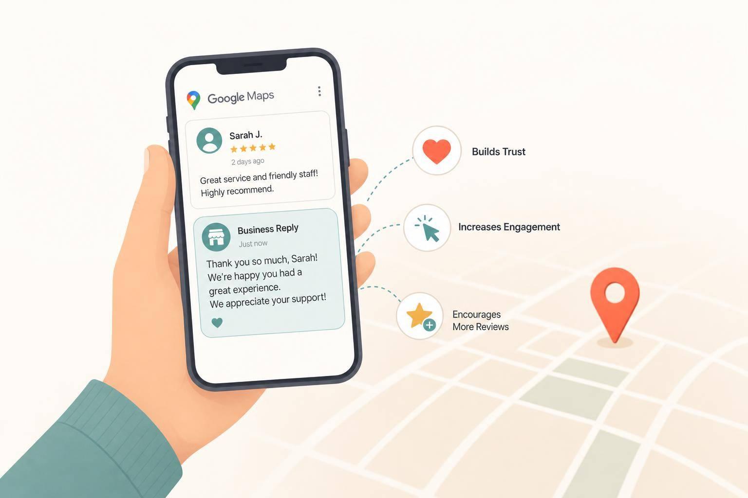
Your NAP - Name, Address, and Phone number - is the cornerstone of local SEO. Did you know that over 80% of people search for local businesses weekly, and 76% of those searches lead to a store visit within a day[23]? That’s why your responsive design must ensure that NAP details are easy to find and read on all devices - no zooming or awkward scrolling required[21].
Here’s how to make your NAP stand out:
To keep things in check, run regular audits using tools designed to verify NAP consistency across directories and listings. This helps ensure your contact details are always correct[21].
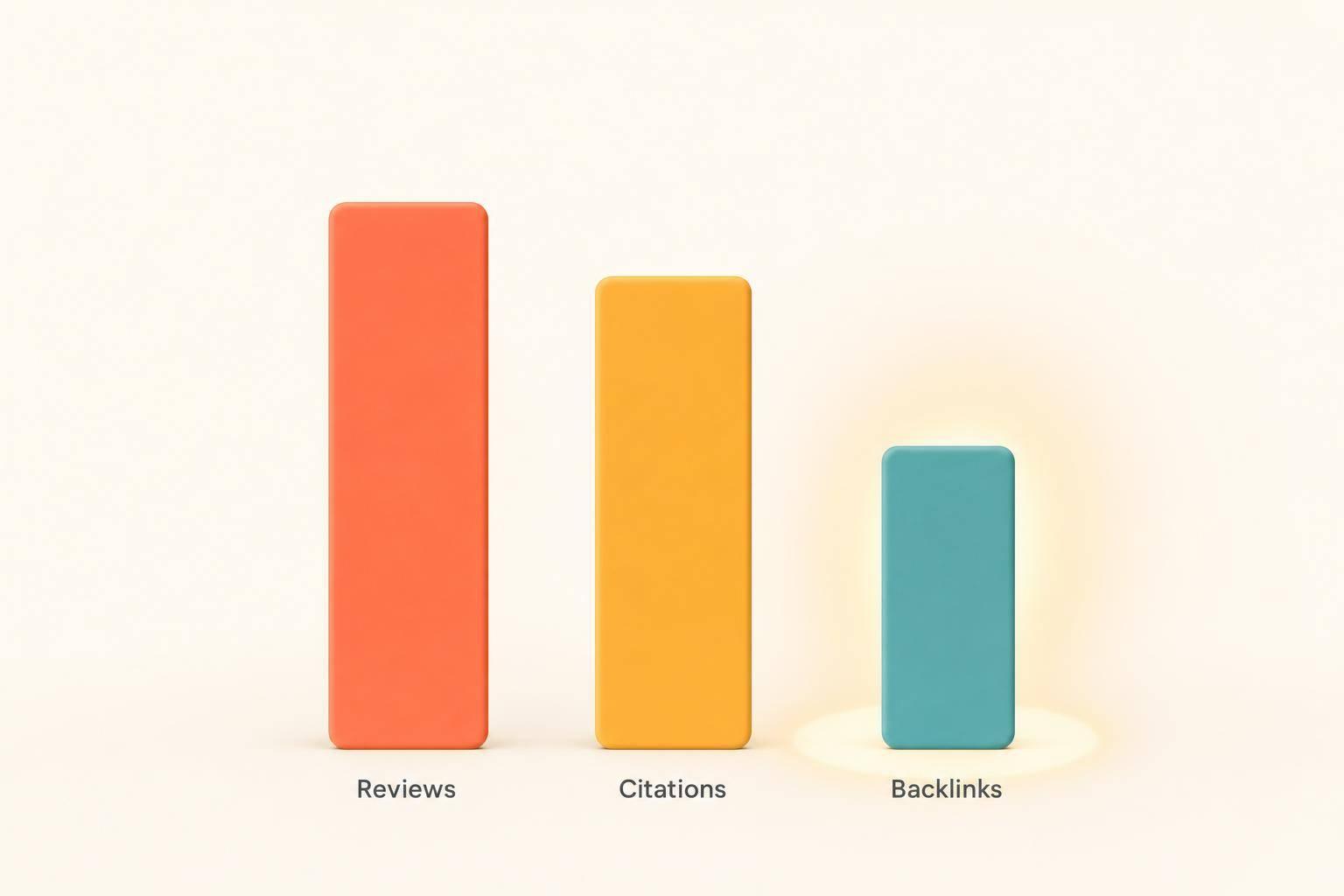
Embedding Google Maps and using local schema markup are powerful ways to boost your visibility in local search results. With 92% of searchers choosing a business from the first page of local results, these steps are essential[25].
Here’s how you can implement these features effectively:
Different sections of your website can benefit from these elements. For example:
| Where to Place Maps | What to Include |
|---|---|
| Contact Page | Embedded Google Map, full NAP in plain text, and a "Get Directions" button |
| Website Footer | A small map or an icon linking to a full map, along with consistent NAP details |
| Location-Specific Pages | Unique maps for each location, location-specific NAP, and driving directions |
| Service Area Pages | Custom maps showing your service radius, area-specific content, and ZIP codes |
| Blog Posts | Maps tied to events or stories, with links to location-specific pages |
Schema markup does more than improve search engine understanding - it can also display rich details directly in search results. For instance:
These features not only improve visibility but also create a better experience for mobile users.
Google’s mobile-first indexing prioritizes mobile-friendly websites, making your optimized mobile site critical for local rankings. This shift builds on earlier strategies for mobile usability, strengthening your connection with local audiences.
"With mobile-first indexing, Google is like a single library that is now beginning to replace print books (desktop pages) with ebooks (mobile pages). Over time, the library will be mostly ebooks (mobile). But print books (desktop) will always remain part of the mix in the library." [27]
For local SEO, your mobile site should seamlessly integrate NAP details, local keywords, and your Google Business Profile[28]. A mobile-friendly design ensures users can easily access key information, like your hours, location, and contact details[2].
Technical performance also matters. Make sure your mobile site loads quickly, uses optimized images, and features clear, concise content[1][26]. Remember, 53% of users will abandon a site if it takes longer than three seconds to load[1]. Google even recommends responsive design as the simplest way to support mobile-first indexing[26].
With 72% of consumers visiting a business within five miles after a local search[25], a responsive design that integrates local SEO features bridges the gap between online searches and in-person visits. This makes it an essential tool for local business success.
Creating a responsive website that excels in local SEO requires a mix of reliable tools and expert guidance. Considering that 76% of local searches happen on mobile devices [3], it's clear that having the right resources in place is essential for local business success.
The backbone of effective responsive design lies in testing and monitoring tools. Google's Mobile-Friendly Test and PageSpeed Insights are excellent starting points. The Mobile-Friendly Test focuses on identifying usability issues specific to mobile devices, while PageSpeed Insights highlights speed-related problems that can affect user experience and search rankings [19]. Both tools offer actionable recommendations to help you make improvements.
To keep track of your site’s performance over time, Google Search Console is invaluable. It provides detailed insights into how search engines view your site, flagging crawl errors, mobile usability issues, and indexing problems that might hinder your local business from appearing in search results [19]. Additionally, it helps you compare how your pages perform on mobile versus desktop, making it easier to spot areas that need attention.
For more in-depth technical analysis, Screaming Frog SEO Spider is a powerful tool. This desktop-based crawler uncovers complex site issues that simpler tools might overlook, making it a great choice for thorough audits [19].
Small business owners who want straightforward insights will appreciate SEOptimer, which delivers SEO reports in a way that’s easy to understand. It evaluates multiple SEO factors and presents findings in a format that’s actionable without being overly technical [19].
Lastly, SE Ranking offers a cloud-based platform that combines website audits with other SEO analysis tools. This all-in-one solution simplifies the process of monitoring how your responsive design performs across various devices and screen sizes [19].
While these tools provide a solid foundation, sometimes businesses need more than just software - they need expert support to bring it all together.
Although tools can offer critical insights, expert guidance can take your responsive design strategy to the next level. Professionals can ensure that your mobile strategy not only meets technical standards but also drives local search success.
One example is Humble Help, a service that specializes in creating dynamic websites that blend responsive design with local SEO optimization [29]. Their approach combines marketing expertise with AI technology to deliver faster results than traditional agencies.
Their all-in-one platform addresses challenges specific to local businesses, focusing on building websites that not only look great but also convert visitors into customers. Beyond web design, their services include optimizing your Google Business Profile, implementing local schema markup, and crafting strategic content that boosts search engine rankings [29].
The impact of expert support is evident in real-world outcomes. Take Amina J., a bakery owner who saw a major boost in her business after working with Humble Help:
"Humble Help's dynamic website doubled my bakery's online orders in just weeks." [29]
Humble Help also integrates real-time AI insights to keep your responsive design aligned with evolving search algorithms. Additionally, they offer on-demand design services, providing graphics, banners, and other visuals within 48 hours to ensure your mobile experience stays fresh and engaging [29].
Combining robust tools with expert services creates a strong foundation for responsive design success. While tools like Google's Mobile-Friendly Test and PageSpeed Insights are essential for monitoring performance, professional services ensure everything is implemented correctly and optimized over time. Together, they address both the technical and strategic aspects of responsive design, helping your local business thrive in a competitive landscape.
With 73.1% of users leaving websites that aren’t mobile-friendly [7], investing in the right tools and expert support isn’t just a good idea - it’s essential. Whether you prefer to manage things yourself using DIY tools or work with specialists who can handle the heavy lifting, the key is finding resources that align with your goals and capabilities.
To truly make the most of local SEO, your website's responsive design needs to be fine-tuned for mobile users. Start with a mobile-first approach - design for smaller screens first and then scale up for larger devices. Why? Because 94% of U.S. smartphone users search for local information on their phones, and your site needs to meet their expectations seamlessly[30].
Make sure your site is easy to navigate on touchscreens. Use large, clickable buttons and a navigation setup that’s intuitive for mobile users. This isn’t just about aesthetics - it’s about usability. And don’t forget speed. A slow site can send users running (literally). Compress images, enable caching, and clean up your code to ensure your pages load quickly. Studies show that visitors are five times more likely to abandon a site if it’s not mobile-friendly[31].
For local SEO, consistency is key. Your NAP (Name, Address, Phone number) should remain identical across all devices and platforms. This consistency helps search engines verify your business details, which is critical for local rankings.
Also, make sure your content speaks the local language - literally. Use geo-specific keywords naturally in your headings, meta descriptions, and other content areas. This helps search engines connect your site to relevant local searches. On the technical side, local schema markup is a must. It gives search engines a clearer understanding of your business details. And don’t overlook the power of click-to-call buttons, which make it super simple for mobile users to reach you with a single tap.
Testing and monitoring are non-negotiable. Tools like Google Analytics and Search Console can help you track performance, but nothing beats testing your site on real devices to catch any usability hiccups.
Responsive design and local SEO go hand in hand. A mobile-friendly site not only enhances the user experience but also boosts your local search rankings by keeping users engaged and reducing bounce rates.
If this all feels overwhelming, services like Humble Help can handle the heavy lifting. Their team specializes in blending responsive design with local SEO strategies, ensuring your site not only looks good but also performs well in local searches.
Investing in a mobile-first, responsive design strategy is worth it. With over 60% of searches happening on mobile devices[32][33] and 76% of local searches coming from mobile users[3], businesses that prioritize these practices are setting themselves up for long-term success in a mobile-driven world.
Having a responsive website is key to improving your local SEO rankings. Why? Because it ensures a smooth and consistent experience for users, no matter what device they’re using. And since search engines like Google give preference to mobile-friendly websites, a responsive design can give you a leg up in local search results.
But that’s not all. Responsive websites typically load faster, which helps lower bounce rates and keeps visitors on your site longer. Both of these factors are known to influence rankings in a positive way. When your site is easy to navigate and performs well on mobile, it not only improves your visibility but also draws in more local customers. That’s a win-win for your online presence and your business.
The key difference between the two lies in their approach and starting point. Mobile-first design prioritizes creating an experience tailored specifically for mobile devices. It focuses on smaller screens, faster load times, and touch-friendly features. Once the mobile experience is perfected, it scales up to accommodate larger screens like tablets and desktops.
Responsive design, however, begins with layouts designed for larger screens and then adjusts to fit smaller devices. While it ensures compatibility across various screen sizes, it doesn’t always place mobile users at the forefront of the design process.
In essence, mobile-first design takes a proactive stance, catering to mobile users first, whereas responsive design takes a more adaptive approach to ensure functionality across all devices.
Keeping your business's NAP information (Name, Address, Phone Number) consistent across all devices and platforms is key to building trust with both search engines and potential customers. Search engines rely on this data to confirm your business's authenticity, which can help improve your local search rankings.
For customers, having accurate and reliable NAP details ensures they can easily find and contact you. This not only improves their experience but also increases the chances they'll choose your business. Consistency eliminates confusion, making sure your audience always has the right details about your location and services.
Discover strategies to elevate your business.