Your logo is the face of your business - it defines your brand, builds trust, and helps customers remember you. A strong logo is simple, recognizable, and communicates your values effectively. Here's how to create one:
A professional logo sets the tone for your business and creates a lasting impression. Whether you design it yourself or hire a professional, focus on clarity, simplicity, and alignment with your brand identity.
Before diving into design software or sketching ideas, take a step back and define your brand's essence. Without a solid understanding of your brand's core identity, you risk creating a logo that might look visually appealing but lacks the power to connect with your audience.
A logo does more than just decorate - it shapes how customers perceive your business and influences their trust in you. When you're clear about your brand's mission, values, and audience, every design decision - like colors, fonts, and symbols - becomes intentional and meaningful.
Your brand's foundation is built on three pillars: vision, mission, and values. These aren't just corporate jargon - they're practical tools that guide your logo design.
Branding expert Jean-Noel Kapferer once said:
"A brand's strength is built upon its determination to promote its own distinctive values and mission." [1]
Understanding these elements helps you create a logo that reflects your goals and resonates with your audience. For example, a tech startup focused on innovation might choose sleek, modern designs with bold colors. Meanwhile, a family law firm prioritizing trust and stability might lean toward traditional fonts and calming tones.
Once your brand identity is clear, the next step is to explore your market environment.
Analyzing your competition isn't about imitation - it's about positioning your brand to stand out. Start by identifying competitors in your industry and market segment. Look at their strengths, weaknesses, and market share to uncover opportunities for your business to differentiate itself.
Take note of competitor logos. This isn't to copy them but to understand what works in your industry and what you can do differently. As DesignMantic highlights:
"When researching your competitors, you would do well to identify the current identities which people are acquainted with within the market, so that you are able to design an identity for your brand that makes it unique and imprints it in the minds of your audience." [3]
Keep an eye on design trends too. Studies show that consumers tend to prefer simple, flat logos over intricate designs - especially when they're unfamiliar with the brand [4]. This preference aligns with the growing demand for clean, timeless designs that are easy to recognize and versatile across platforms.
Don’t overlook indirect competitors - businesses that may not offer the same product or service but still compete for your audience’s attention and dollars. These insights will help you carve out a distinct identity in your market.
Your logo should resonate with your audience, and that means considering local and regional influences. In the United States, for instance, colors carry specific meanings: red often conveys energy and urgency, blue suggests trust and stability, and green symbolizes growth or eco-consciousness.
Research the design styles and color trends popular in your area. What works in a bustling city like New York might not have the same impact in a small town in Montana. For example, a business in New England might incorporate elements reflecting the region’s historical roots, while a Silicon Valley company might lean into futuristic, tech-inspired visuals.
Cultural and historical context matters. Missteps here can send unintended messages, while thoughtful alignment with local preferences can deepen customer connections. As 99designs explains:
"A logo design is responsible for conveying so much without words, encapsulating who a business is and what it does." [2]
To ensure your logo resonates with your audience, gather feedback through focus groups or surveys. This can help you refine your design and avoid potential miscommunication.
Howard Schultz, the CEO of Starbucks, once noted:
"If people believe they share values with a company, they will stay loyal to the brand." [1]
Your logo should not only reflect your business's values but also align with the preferences and culture of the community you serve. This approach builds trust, loyalty, and long-term success in your local market.
Using your brand insights and an understanding of local market trends, you can craft design elements that truly reflect your business. Your logo’s colors, fonts, and symbols all work together to express your brand’s personality and values.
Studies suggest that people form subconscious opinions about a product within 90 seconds of seeing it, with 62% to 90% of that judgment based on color alone [5]. This underscores how much visual design influences first impressions. Let’s break down how colors, fonts, and symbols contribute to creating a logo that stands out.
Selecting the right colors goes beyond aesthetics - it’s about understanding psychology, cultural associations, and how colors align with your brand’s message. Before diving into specific shades, clarify what your brand represents and consider how different colors can either enhance or conflict with that message [5].
Start with a black-and-white design to ensure your logo’s structure is solid before introducing color [7]. From there, choose hues that amplify your brand’s identity.
Most successful logos stick to just two colors [7]. Among them, blue is a favorite, thanks to its association with trust, reliability, and professionalism - qualities that resonate strongly with American consumers. For instance, red often conveys energy and urgency, making it popular for food brands and call-to-action designs. Green suggests growth and health, black exudes sophistication, and yellow sparks optimism and creativity, though it can sometimes be harder to read.
Take Tiffany & Co. as an example. In 1998, they trademarked "Tiffany Blue®" and standardized it using the Pantone® Matching System, ensuring their signature color was instantly recognizable across all platforms [5].
To refine your palette, try a color palette generator to find harmonious combinations and deepen your knowledge of color theory [5]. Also, test your logo in grayscale, black and white, and inverted formats to ensure it holds up in every context [5]. While keeping an eye on competitors’ color choices is helpful, let your brand’s unique identity guide your decisions [5].
"Like a carefully chosen brand name, color carries intrinsic meaning that becomes central to the brand's identity, contributes to brand recognition, and communicates the desired image." [6]
Typography is just as important as color when it comes to communicating your brand’s personality and values. The right font ensures your message is clear and consistent across various media, sizes, and backgrounds [9].
Stick to simple, timeless fonts. Avoid trendy typefaces that might age poorly, and instead, opt for designs that will stay relevant for years [8].
| Font Type | Characteristics | Best For | Examples |
|---|---|---|---|
| Serif | Classic, formal, with small flourishes | Traditional, authoritative brands | Garamond, Baskerville, Times New Roman |
| Sans-serif | Modern, clean, straightforward | Tech, professional services | Helvetica, Futura, Roboto |
| Script | Elegant, mimicking handwriting | Creative or lifestyle brands | Various calligraphy-style fonts |
| Display | Decorative, bold, and impactful | Fashion, music, entertainment | Custom decorative typefaces |
Sans-serif fonts are particularly popular for modern brands, especially in tech and professional services, as their clean lines align with American preferences for minimalism and clarity [8]. Meanwhile, script fonts add warmth and creativity but should be used sparingly to maintain readability, especially at smaller sizes.
If you’re combining multiple fonts, make sure they complement each other. Pairing a serif with a sans-serif font, for example, can create a balanced look [9]. Pay attention to details like x-heights and font weights to establish a clear visual hierarchy [9]. Accessibility is also key - choose fonts that are easy to read for all users [9].
"Choosing the right font for your logo is a critical step in creating a professional and memorable brand image." – Matt Keyser, Fourthwall [8]
Scalability matters, so test your font at different sizes to ensure it remains legible and impactful, whether it’s on a social media profile or a tiny favicon [8].
With your colors and typography in place, it’s time to add symbols that enhance your brand identity. A well-chosen symbol can quickly communicate what your business is about, but it needs to be simple, memorable, and versatile. Whether it’s a small social media avatar or a large storefront sign, your symbol should work at any scale.
Abstract symbols often offer more flexibility than literal ones. For example, while a hammer icon might clearly represent a construction company, an abstract design can evolve alongside your business as it grows. Think about Apple’s bitten apple - it doesn’t directly represent technology, yet it’s one of the most recognized symbols in the world.
Cultural context is crucial, especially in a diverse market like the United States. A symbol that resonates in one region might not have the same impact elsewhere. Research your chosen imagery thoroughly, particularly if you plan to expand beyond your local market.
Decide how your symbol will interact with your typography. Some logos integrate the two seamlessly, while others keep them separate. Choose the approach that aligns with your brand’s personality and practical needs.
Versatility is key. Your symbol should look great in color, black and white, or grayscale, and it should maintain its impact across all formats. Test your design with real customers through surveys or focus groups to ensure it resonates as intended.
Symbols don’t gain recognition overnight. Consistent and positive use across all touchpoints is what builds familiarity and trust over time. Patience and strategic application are essential for turning your logo into a lasting symbol of your brand.
With your brand elements clearly defined, it's time to transform those ideas into a logo that truly represents your business. This stage is where creativity meets strategy, blending your brand identity with market insights to craft a logo that stands out.
Start with the basics - grab a pen and paper. Sketching allows you to experiment freely without the constraints of digital tools. The goal here isn’t perfection but to generate as many ideas as possible. Refinement comes later [13].
A mind map can help you connect different elements, offering a clearer view of how your ideas align. Think about the shapes, symbols, and letterforms that could represent your brand. For example, what imagery naturally ties to your product or service? How can your brand’s values shine through in your designs [11][12]?
Collaboration can also spark new ideas. Whether it’s brainstorming with your team or seeking input from mentors or business groups, fresh perspectives often lead to breakthroughs you might not achieve alone. As designer Alex Osborn said:
"It is easier to tone down a wild idea than to think up a new one" [11].
Once you’ve explored multiple directions, narrow your focus. Experiment with typography, symbols, and compositions that align with your brand’s personality. Create lists of adjectives that describe your brand and the emotions you want your logo to evoke. From there, refine your strongest concepts and prepare to explain the thought process behind each one [10][13].
After brainstorming and sketching, digital tools can take your ideas to the next level. These tools allow for precision and efficiency, making professional-quality design accessible to businesses of all sizes.
For experienced designers, software like Adobe Illustrator is a powerhouse. It offers advanced customization options but comes with a learning curve. Adobe products dominate the graphic design market, with Illustrator accounting for 12.25% of it [14].
For those without design expertise, user-friendly platforms like Canva provide an excellent alternative. Canva boasts a 4.7/5 rating on G2, backed by over 20,000 reviews, thanks to its intuitive interface and vast library of templates [15]. Similarly, Looka, another popular option, holds a 4.6/5 rating on Trustpilot from nearly 14,000 reviews [15].
AI-powered tools are also gaining traction, offering quick, automated design concepts based on your business name and industry [14]. While these tools can save time, they’re most effective when paired with a clear understanding of your brand identity.
Choose your tools based on your experience, budget, and project needs. Many successful logos have been created using accessible platforms - what matters most is your ability to use the tool effectively, not how expensive it is.
Your logo must perform well in various formats, from small social media icons to large storefront signs. Testing your design across different mediums helps identify potential issues early on [12]. For example, see how it looks on a website header, business cards, merchandise, or even as a mobile app icon.
Feedback is essential. Ask local customers how they perceive your design and whether it aligns with their expectations of a company like yours [10]. Create mockups to test your logo in real-world scenarios. Print it on business cards, simulate storefront signage, or check its clarity on mobile devices. Collect input from diverse groups and encourage detailed feedback - what works, what doesn’t, and why? Be open to criticism that can lead to meaningful improvements [11].
Cultural context matters, especially if your business spans different markets. Colors or symbols that resonate with one audience might not connect with another. Test your logo with individuals from various age groups and backgrounds to ensure it appeals broadly.
Document all feedback and look for common themes. While input is valuable, remember that your final design should align with your brand strategy and long-term goals. A well-tested logo is one that communicates your brand effectively and resonates with your audience.
With your refined design and the feedback you've gathered, it's time to finalize your logo and prepare it for all the ways it will represent your brand. This stage involves saving your logo in the right formats, ensuring consistent use across platforms, and, if necessary, seeking professional input to strengthen your overall branding.
Your logo needs to shine everywhere - whether it’s on a tiny social media icon or a massive storefront sign. To make this happen, you’ll need to save it in different file formats, each tailored for specific uses.
Start by securing the source files. If you worked with a designer, ensure you receive the AI (Adobe Illustrator) or EPS (Encapsulated PostScript) files. These are your master files, and they allow you to export your logo into other formats as needed [16].
For print materials like business cards, brochures, or signage, vector files are essential. EPS files are particularly useful because they can be scaled to any size without losing quality [16][17].
For digital use, save your logo in web-friendly formats. PNG files are great for websites and social media due to their support for transparent backgrounds [16]. If you need smaller file sizes and transparency isn't a concern, JPG works well [16]. For websites, SVG files are a top choice because they scale perfectly on any screen [16].
Here’s a quick guide to the essential file formats:
| Format | Best For | Key Benefit |
|---|---|---|
| EPS | Print materials, business cards | Scales without quality loss |
| PNG | Websites, social media | Supports transparent backgrounds |
| JPG | Email signatures, web use | Smaller file sizes |
| SVG | Websites, digital applications | Perfect scaling on all devices |
Once your logo is properly formatted, it’s time to make it visible wherever your business exists. Consistent branding is powerful - it can increase revenue by 10% and build trust with 66% of consumers [19].
Start with your website, often the first place customers engage with your brand. Place your logo in the top left corner of your site, as this is where most people naturally look first. Make sure it’s prominent but not overpowering, and link it back to your homepage for easy navigation.
On social media, your logo will often serve as your profile picture. Test how it looks at smaller sizes - if your full logo includes text that becomes unreadable, consider using a simplified version or just your brand mark.
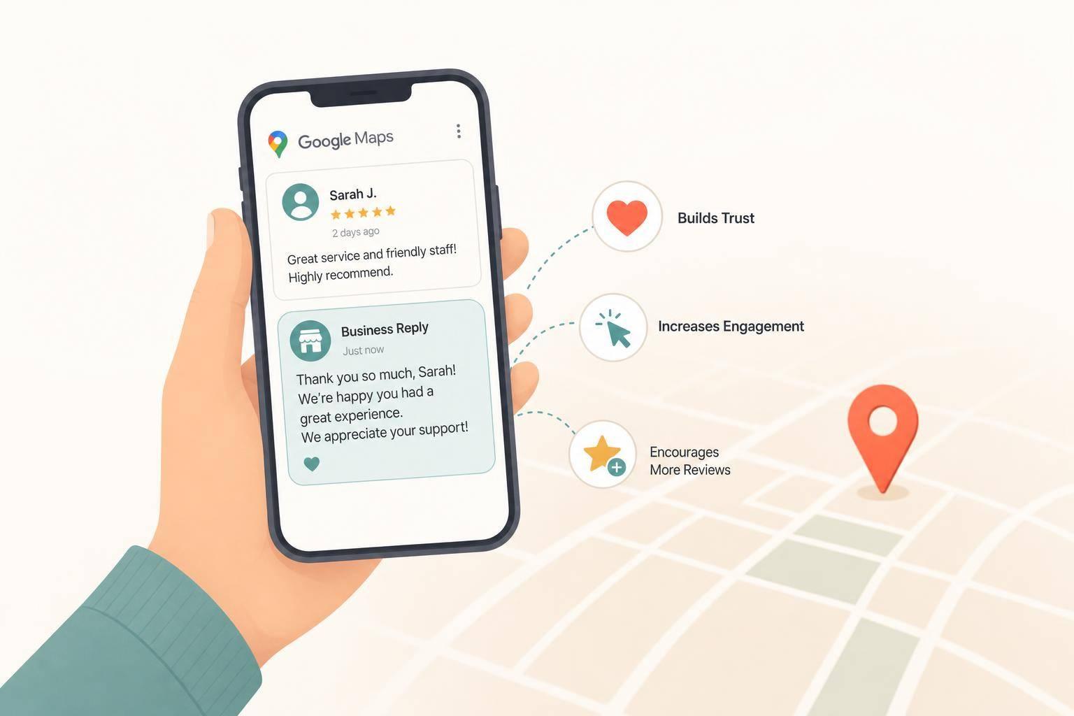
Don’t overlook email branding. Include your logo in your email signature to reinforce your brand identity in every message. For local businesses, upload your logo to your Google Business Profile so it appears in search results and on Google Maps.
Print materials offer another opportunity to showcase your logo. High-quality versions are ideal for business cards, brochures, and other marketing materials. Statistics show that 46% of people have been motivated to connect with a brand on social media after seeing their print designs [20]. You can even include social media handles on print materials to bridge the gap between offline and online branding. To ensure consistency, create a simple brand style guide that outlines your logo’s color codes, spacing, and usage guidelines [18].
After formatting and deploying your logo, you might consider professional help to take your branding to the next level. While many small business owners handle logo creation on their own, working with a professional designer can make a big difference. Designers bring expertise in areas like color psychology, typography, and market positioning, ensuring your logo doesn’t just look good but also helps drive business results.
For example, services like Humble Help offer comprehensive branding solutions. They provide logo design, brand kits, and additional marketing support, such as Google Business Profile optimization and local SEO strategies. Their Brand Boost Package is a great option for new businesses aiming to establish a credible online presence with cohesive design elements.
Whether you decide to go with professional help or stick with your in-house design, remember that your logo is an investment in your brand’s future. Just look at Nike’s Swoosh - designed in the 1970s, it has remained almost unchanged and is now one of the most recognizable logos in the world. That level of consistency keeps the brand firmly in the minds of consumers [19].
Designing a logo that sticks in the minds of your customers begins with understanding your brand's identity, knowing your audience, and making thoughtful design decisions. Start by defining your business's core values and studying your local competitors to understand how you can stand out. From there, choosing the right colors, fonts, and symbols lays the groundwork for a design that resonates with your target market.
Refining your logo is key to making it truly memorable. Research shows that simple logos are 13% more likely to be remembered by consumers [21]. This highlights the importance of keeping your design clean and focused. Before finalizing, test your logo in real-world scenarios to ensure it performs well across various contexts. Legendary graphic designer Paul Rand once said:
"The effectiveness of a logo depends on distinctiveness, visibility, adaptability, memorability, versatility, and timelessness." [23]
Every element of your logo matters. Strategic use of color, structure, and consistency can significantly enhance brand recognition and even impact your revenue [21][22].
To create a logo that truly sticks, gather feedback from a small group of people and see if they can recall it after a few days [21]. Test the design across digital platforms and print materials to ensure it works everywhere. The ultimate goal is to craft a logo that not only sets you apart from competitors but also aligns with your brand's core message [21].
If you're unsure about the process, don't hesitate to seek professional help. Expert guidance can take your logo and brand presence to the next level. Services like Humble Help offer specialized support, such as their Brand Boost Package, which includes logo creation, Google Business Profile optimization, and local SEO strategies - valuable tools for small businesses looking to grow their market presence.
When creating a logo for your small business, simplicity and clarity should be your top priorities. A straightforward design is not only easier to recognize but also more adaptable across various platforms - whether it’s on a tiny business card or a large storefront sign.
Avoid the temptation to copy existing logos or rely on generic design elements. These approaches can water down your brand's individuality. Instead, aim for a design that feels distinct and connects with your target audience on a personal level. Keep the layout visually balanced and free from unnecessary clutter, ensuring the core message of your logo stands out.
It’s also a good idea to test your logo within your local community. A logo that resonates with your audience and aligns with your business's values will leave a stronger impression. If you’re unsure where to start, professionals like Humble Help can provide expert assistance, offering marketing solutions specifically tailored for small businesses.
When designing a logo that works everywhere, start with a vector format like SVG or AI. This allows your logo to scale perfectly, whether it’s on a tiny business card or a massive billboard - no blurry edges, ever.
Keep the design simple and uncluttered so it looks sharp and professional, no matter the size or background. Also, pick a color palette that works well both online and in print. Don’t forget to test your logo in black and white to ensure it stays recognizable and versatile. A great logo should stand out on a website, social media, or even physical merchandise.
Hiring a professional designer gives your logo a polished, distinctive look that aligns perfectly with your brand’s identity. A well-crafted logo from a professional not only enhances your brand’s credibility but also helps you stand out in a crowded marketplace. Plus, these designs are usually more flexible, making them suitable for various long-term branding purposes.
On the flip side, DIY tools are an affordable and convenient option, ideal for quick or short-term needs. However, they often fall short in delivering the uniqueness and refinement that a professional touch can achieve. For small businesses aiming to create a strong and lasting impression, working with a professional designer is often the better route.
Discover strategies to elevate your business.