Mobile navigation is critical for local SEO success. With 60% of Google searches happening on mobile devices and 88% of local searchers calling or visiting a business within 24 hours, optimizing your mobile site can directly impact your visibility and conversions. Here’s what you need to know:
Understanding these principles is essential for improving local SEO and keeping potential customers engaged. Think of them as the foundation for creating a user-friendly experience that not only keeps visitors on your site but also encourages them to take action. These basics set the stage for more advanced navigation techniques covered later.
When it comes to local searches, users want quick and easy access to critical information. Responsive design is the gold standard for mobile optimization. Since Google uses mobile-first indexing - focusing on the mobile version of your site to determine rankings - it’s crucial to ensure your site looks and works great on any device [4][5].
Responsive design ensures your layout, images, and content automatically adjust to fit different screen sizes. Google even recommends it because it’s straightforward to implement and maintain [4]. For local businesses, this is especially important. Mobile users aren’t casually browsing - they’re actively searching for details like your address, business hours, or phone number. Make their experience seamless by keeping your navigation simple and clear. Stick to 4–8 main menu items with easy-to-read labels and good contrast [3].
Site speed isn’t just about convenience - it’s a direct factor in search rankings and can significantly impact your local SEO. If your site takes longer than 3 seconds to load, over half of users will leave. Stretch that to 5 seconds, and 90% of your visitors are gone [6][9].
For local businesses, speed is even more critical, especially with "near me" searches skyrocketing by over 500% in recent years [8]. Whether someone’s searching for a local restaurant, a plumber, or a nearby store, they expect instant results. A slow-loading site doesn’t just frustrate users - it sends them straight to your competitors.
To improve loading speeds, try these techniques:
For a more advanced approach, consider lazy loading for images and videos or prioritizing above-the-fold content so the most important parts of your page load first [6].
As Tez Ferguson, CEO of Xploited Media, puts it:
"Core Web Vitals alongside a smooth user journey on every resolution represent the major principle of mobile search engine optimization." [1]
Mobile users rely on touch, so your navigation must be easy to tap and intuitive. Buttons should be at least 44x44 pixels to avoid frustrating misclicks [2].
Keep navigation simple and focused for users on the move. Limit main menu options to 5–7 essential items to avoid overwhelming visitors. Hamburger menus or collapsible navigation can help save screen space while keeping options accessible [2]. Sticky navigation bars are another smart choice for local businesses, as they keep key details - like your phone number or address - visible as users scroll [2].
Here are some ways to refine touch navigation:
Adding breadcrumb navigation can also be helpful, giving users a clear sense of where they are on your site and letting them easily backtrack to previous pages [2]. With these adjustments, your site will feel intuitive and user-friendly, keeping visitors engaged and driving local conversions.
These mobile navigation features are tailored to meet the needs of local customers while boosting SEO performance for small businesses. With mobile devices accounting for 88% of local searches[11], implementing these features can be the deciding factor in whether a customer chooses your business or a competitor’s.
Fixed navigation bars are a smart way to keep essential pages - like contact information, services, and location details - accessible at all times. A sticky header ensures that critical details, such as your phone number or address, are always visible, making it easier for users to take immediate action.
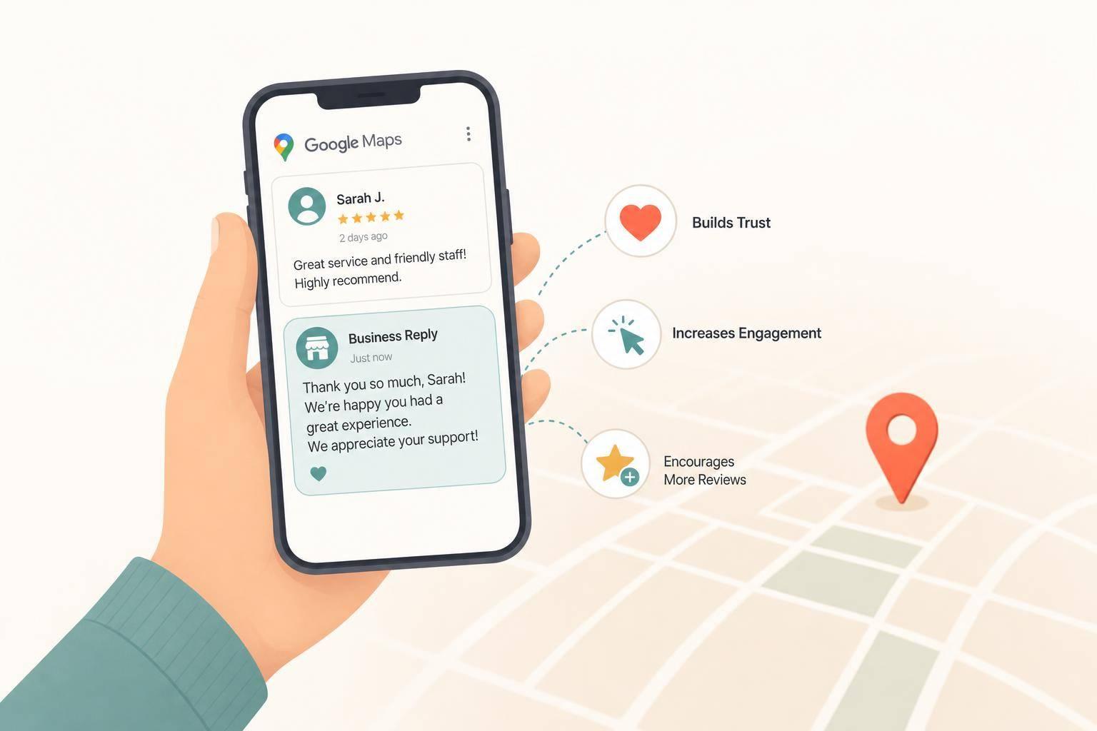
Adding click-to-call functionality near service details or operating hours can also be a game-changer. This feature encourages users to call with specific intent, generating higher-quality leads instead of casual browsers[11].
"If your website isn't mobile-friendly in 2025, you're essentially invisible to most local searchers."[11]
The key is keeping the navigation clean and focused on actions that matter most to your audience.
Features like maps and directions are no longer optional - they’re essential for capturing local traffic. With over 60% of consumers relying on Google Maps as their preferred navigation app, integrating your business with native map applications ensures a seamless user experience[10].
For users who deny location permissions, fallback IP geolocation can still provide relevant local information. This way, even privacy-conscious users can access directions or nearby services[11].
Visuals also play a major role. Businesses with updated photos of their storefront, products, or services receive 42% more direction requests compared to those with outdated images[11]. Including high-quality, recent photos helps customers recognize your business when they arrive. Additionally, designing touch-friendly map interfaces with clear directions and one-tap calling ensures a smooth experience for mobile users.
These location-based features, combined with clear contact displays, are vital for creating a strong local SEO strategy.
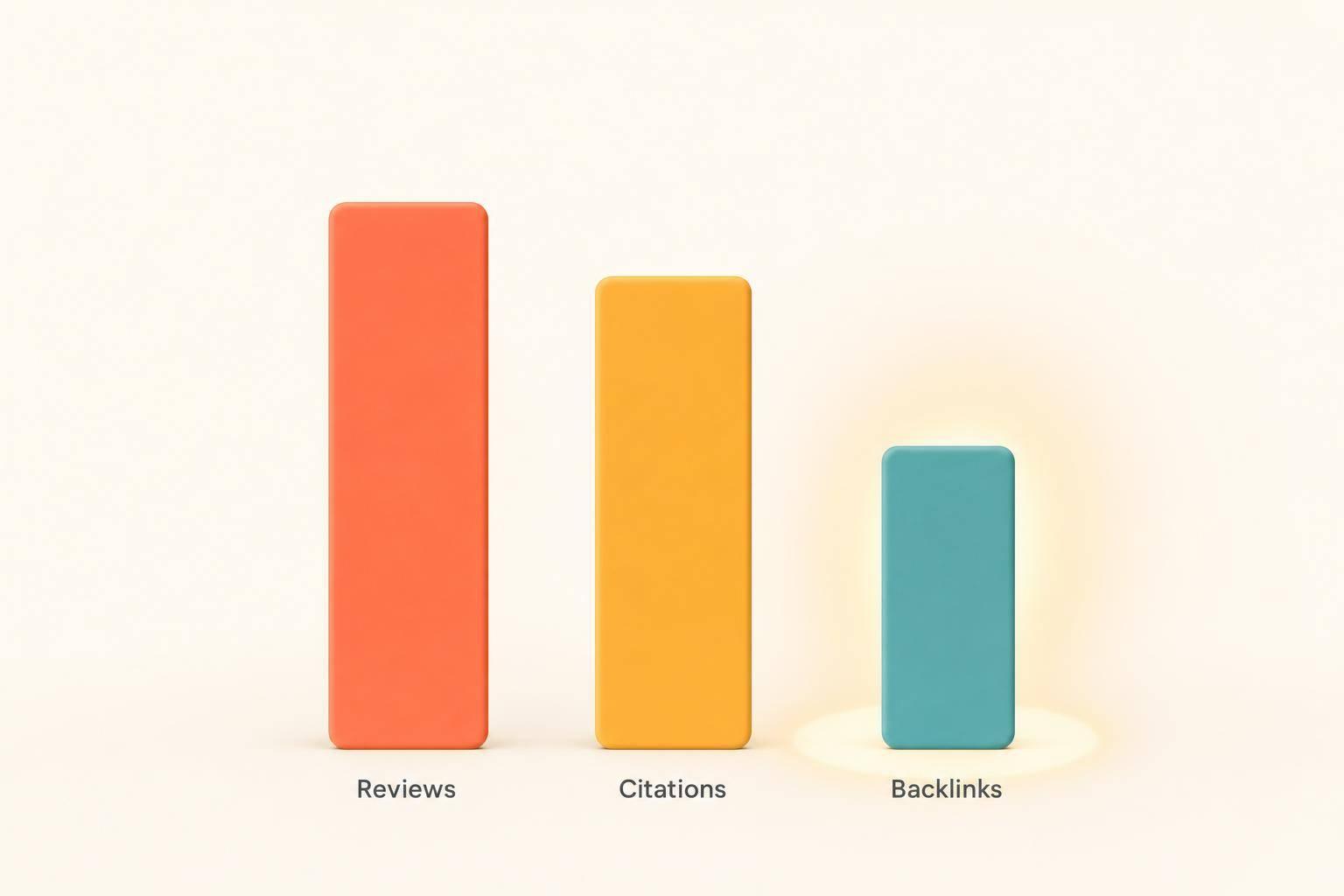
Accurate NAP (Name, Address, and Phone number) details are a cornerstone of local SEO. NAP citations contribute to about 13% of the factors that influence local search rankings, making consistency across platforms critical[13].
Trust is at stake here. Studies show that 73% of consumers lose trust in a business when they encounter inaccurate information online, and 67% are more likely to choose a competitor if they find outdated or conflicting details[12][13].
For mobile users, displaying NAP information prominently is even more important. Searches using “near me” keywords often lead to rapid decisions - 76% of users visit a business within 24 hours, and 80% of local searches result in conversions when the information is accurate[1][12].
"When your NAP information is consistent everywhere it appears, it tells search engines that your business is credible and trustworthy, which can significantly improve your local search rankings."[12]
Make sure your NAP details are easily visible on mobile screens. Use schema markup, such as LocalBusiness JSON-LD, to help search engines understand your business information. Display your NAP prominently on your homepage, contact page, and footer. Considering that “near me” searches have grown by 900%, ensuring your information is accurate and accessible has never been more crucial[1].
Refining your mobile navigation isn’t just about aesthetics - it plays a critical role in boosting both local conversions and SEO. By concentrating on a few key areas, you can turn mobile visitors into paying customers while improving your local search performance.
Mobile users expect speed and simplicity. Since 88% of consumers who search for local businesses on their phones either call or visit within 24 hours[1], making actions effortless is essential.
Click-to-call buttons should be easy to find, not just in the header but also near service descriptions, pricing details, and contact information. Similarly, integrate click-to-map features that open in the user’s preferred navigation app. Given that over 60% of Google searches are done on mobile devices[1], these one-tap features can make all the difference.
For service-based businesses, booking buttons are equally important. Instead of forcing users through multiple steps, a single tap should open your booking system or initiate a call. This approach aligns with the 76% of searchers who use "near me" keywords and visit a business within 24 hours[1].
To ensure usability, design buttons and links with a minimum size of 44x44 pixels, which fits the average finger tap area and avoids user frustration[2].
Overly complicated menus can confuse users and hurt your SEO. A good rule of thumb is to make key pages accessible within two taps[14]. This means simplifying your menu structure and focusing on essentials like services, location/contact info, and booking or quote requests.
For mobile users, hamburger menus work well when done right. They save screen space while keeping options accessible. However, make sure the hamburger icon is easy to spot and that the menu opens quickly, without fancy animations that could slow down older devices[2].
Clear, straightforward labels are a must. Avoid creative but vague terms like "Solutions" or "Connect." Instead, opt for direct terms like "Services" or "Contact Us." This clarity benefits both users and search engines, improving SEO rankings[2].
Breadcrumb navigation is another helpful tool for mobile sites. It allows users to easily backtrack without relying on the browser’s back button. Add breadcrumbs to deeper pages like service details or blog posts to enhance navigation[2].
Regular testing on various devices is crucial to catch and resolve issues before they affect your users.
Tools like Google Search Console, Google’s Mobile-Friendly Test Tool, and PageSpeed Insights can provide actionable insights into your mobile site’s performance. Use these tools to monitor reports, identify problem areas, and fix elements that slow down navigation[16].
When testing, recruit individuals who match your target audience rather than relying on team members who may already be familiar with the site. Start by testing your current navigation design to establish a baseline for future comparisons[15]. Pay attention to recurring issues - if multiple testers struggle with the same element, it’s a clear sign that adjustments are needed.
After implementing changes, test again to ensure the updates work as intended. Iterative testing not only resolves issues but also sets the stage for more advanced navigation enhancements.
Choose a navigation style that enhances local SEO while keeping your customers engaged.
| Navigation Type | Best For | Key Advantages |
|---|---|---|
| Hamburger Menu | Service businesses with diverse offerings | Saves screen space and supports local features like click-to-call and maps. |
| Tab Bar Navigation | Restaurants, retail stores | Keeps vital info (menus, hours, contact) always visible. |
| Accordion Menu | Multi-location businesses | Organizes content hierarchically, with expandable sections for specific locations. |
| Sticky Top Bar | Emergency services, contractors | Ensures constant access to contact options for urgent needs. |
| Bottom Navigation | Appointment-based businesses | Optimized for thumb placement, ideal for actions like booking. |
These frameworks are designed to build on mobile navigation basics, ensuring a smooth local user experience.
Hamburger menus are perfect for saving screen space while keeping essential features like click-to-call buttons and embedded maps handy. The collapsible design prevents visual clutter, but the menu icon may be less intuitive for some users, particularly older audiences.
Tab bar navigation works well for restaurants and retail stores, offering constant visibility to key options like menus, hours, and contact details. The downside? Limited space, which might force you to prioritize fewer options.
Accordion menus shine for businesses with multiple locations or complex offerings. This format organizes content hierarchically, letting users expand sections to view details about individual locations, including contact info and booking links.
Sticky navigation bars provide uninterrupted access to contact options, making them essential for emergency services or contractors. With 88% of mobile users contacting or visiting a local business within 24 hours of a search [1], having persistent contact options can significantly improve conversion rates.
Bottom navigation is user-friendly for appointment-based businesses, as it aligns with natural thumb placement and supports quick actions like booking.
When choosing a navigation framework, consider your audience and business type. For instance, a plumbing company might benefit from a sticky top bar with a click-to-call feature, while a restaurant would thrive with a tab bar showcasing hours, menu, and location.
With mobile searches projected to make up 60–70% of all online searches by 2025 [17], it’s more important than ever to align your navigation strategy with local user expectations. Test your design across various devices to ensure smooth usability and optimal tap targets.
Getting mobile navigation right for local SEO requires more than just basic functionality - it’s about creating a seamless experience that drives conversions and connects with local customers. To achieve this, professional tools can make a world of difference.
Here’s a breakdown of some top tools to simplify and improve your mobile navigation strategy for local SEO:
"Laurie Williams, Founder at Trumpet Marketing, emphasizes that site speed and optimized graphics directly impact mobile rankings" [1].
When choosing tools, prioritize those that ensure listing accuracy and consistency across all platforms. Features like review monitoring, automated responses, and detailed analytics are essential for understanding how users interact with your mobile navigation. And don’t forget to consider your budget - while some tools charge monthly fees, others offer pay-per-use options. For instance, Localo starts at $29/month per location and even has a free plan, making it a good option for smaller businesses. Most platforms also offer free trials (typically 14 days), so you can test features before committing.
Look for tools that are scalable, provide robust analytics, and offer responsive customer support. Training resources and technical assistance can vary widely, so it’s worth prioritizing platforms that provide comprehensive support. These professional solutions are key to turning mobile navigation into a powerful tool for local SEO.
For small businesses, tackling mobile navigation optimization can be overwhelming, especially when juggling day-to-day operations. That’s where Humble Help comes in. They combine AI-powered automation with human expertise to deliver tailored mobile solutions for local businesses.
Their services go beyond basic website design. They focus on dynamic, mobile-friendly features like location-based functionality, click-to-call optimization, and ensuring fast-loading navigation elements across all devices. Their Google Business Profile optimization is particularly impactful, considering that 88% of consumers who search for local businesses on mobile either call or visit within 24 hours [1].
Humble Help also addresses technical aspects that many business owners overlook, such as schema markup, optimizing oversized image files that slow down mobile performance, and maintaining consistent Name, Address, and Phone (NAP) details across all platforms. Their Google Maps SEO service targets the 60% of consumers who rely on Google Maps as their primary navigation app [10].
For businesses looking to test the waters, their Brand Boost Package is a great starting point. This free package includes website check-ups to identify navigation issues, fresh design layouts optimized for mobile, and content creation aimed at boosting local search visibility. It’s a risk-free way to experience their capabilities before committing to more advanced solutions.
What sets Humble Help apart is their all-in-one approach. Rather than juggling multiple tools and subscriptions, their platform integrates everything - from website performance monitoring to automated review responses. This streamlines the process and ensures that mobile navigation is part of a larger local marketing strategy.
Their personalized dashboard provides real-time insights into mobile performance metrics, helping business owners see how navigation improvements affect local search rankings and customer engagement. This focus on actionable data ensures that changes don’t just check technical boxes - they drive real business growth.
To truly excel in mobile navigation, you need to understand what your users are looking for and deliver it quickly. With over 60% of Google searches now happening on mobile devices [1], your navigation must be seamless on smaller screens.
Speed is critical. Kurt Fischman, Principal at Growth Marshal, captures it well:
"Mobile SEO is a speed date with Google - you've got to load fast, look clean, and speak structured data. Remember, Google doesn't rank mobile sites - it ranks mobile experiences. Prioritize speed, scroll behavior, and semantic clarity" [1].
When designing your navigation, aim for simplicity and clarity. Keep the top-level menu between four and eight items [3]. For additional options, consider a vertical menu triggered by a recognizable icon. Use clear, familiar symbols and ensure touch elements are at least 48 pixels in size, with 32 pixels of spacing between them [3]. This reduces the risk of users accidentally tapping the wrong option, which can be frustrating.
For local businesses, make sure essential details like your address, phone number, hours, and directions are immediately accessible [3]. Clickable phone numbers and addresses are a must, and your NAP information (Name, Address, Phone Number) should be prominently displayed. These small but crucial details ensure a smooth experience for users on any device.
While maintaining visual consistency between mobile and desktop sites is important for trust, remember that mobile users often have different needs. They want quick, easy actions - like calling your business, getting directions, or checking your hours - with minimal effort.
Tez Ferguson, CEO at Xploited Media, highlights the importance of technical precision:
"Core Web Vitals alongside a smooth user journey on every resolution represent the major principle of mobile search engine optimization" [1].
This means ensuring that mobile users enjoy a smooth and efficient experience across all devices.
Don’t forget to test your navigation on various devices. What works well on your phone might not perform the same on someone else’s. Use high-contrast text, ensure fonts are large enough to read without zooming, and regularly check usability.
Ultimately, mobile navigation isn’t just about looking good - it’s about turning searches into conversions. Each unnecessary tap or confusing menu risks losing users to competitors who offer a smoother, faster experience.
To make sure your mobile site loads quickly and keeps local users interested, there are a few tweaks you can focus on. Start by compressing your images - this reduces file sizes without losing quality. Also, cut down on unnecessary page elements to improve loading times. A Content Delivery Network (CDN) can be a game-changer, as it distributes your content across multiple servers, speeding up delivery.
Another smart move is enabling browser caching. This way, returning users won't have to reload the same resources every time they visit. Pair this with a reliable hosting provider that offers fast server response times. Don’t forget to prioritize mobile-first design to ensure your site is responsive and easy to navigate on smaller screens. Regularly test your site’s speed with tools like Google PageSpeed Insights, and aim for pages to load in under three seconds. A faster site means lower bounce rates and a better experience for your visitors.
To boost your local SEO through mobile navigation, pay attention to these crucial aspects:
Focusing on these elements will create a seamless mobile experience, making your site more user-friendly while boosting your local search rankings.
Responsive design plays a key role for local businesses by ensuring websites look and work well on any device, whether it’s a smartphone, tablet, or desktop. This creates a smoother user experience, which naturally leads to better engagement and happier visitors. Let’s face it - people are far more likely to stick around on a site that’s quick, easy to navigate, and optimized for mobile.
What’s more, Google gives preference to mobile-friendly websites in its search rankings, which can significantly improve local search visibility. For businesses that rely on nearby customers, this is a game-changer. Many mobile searches lead to immediate actions, like making a call or visiting a location. A responsive design helps turn those searches into actual customer interactions, boosting both online traffic and in-person visits.
Discover strategies to elevate your business.